
eLearning is on the rise, with hundreds of new offers emerging in this booming market every day. The good news is that you can also get a fair share of this market with an innovative, user-friendly, and appealing app. The bad news is that modern users are very picky and sophisticated, urging web developers to overstretch themselves to win the consumers’ loyalty and trust.
Here we share the advanced strategies of UI and UX design that can maximize the chances of your new e-learning tool’s adoption by the users. Keep them in mind when designing your new digital product, and your chances for market success are sure to multiply.
Table of Contents
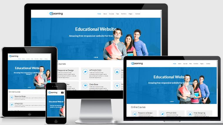
Why Responsive Design?
In a nutshell, users are getting increasingly mobile in the 2020s, and the percentage of time spent with mobile gadgets instead of desktop devices is rising steadily year by year. The times when students sat at their computers and studied for hours are gone. Now an average user consumes educational content in small chunks via their mobile device. It happens on the daily commute to work or college, when walking a dog, cooking breakfast, or having a jogging session.
Your task is to embrace this trend and give mobile-friendly content to your users. If your target customers see the value and responsiveness of your offered resource to their digital content habits, you’re sure to win the loyal audience quicker.
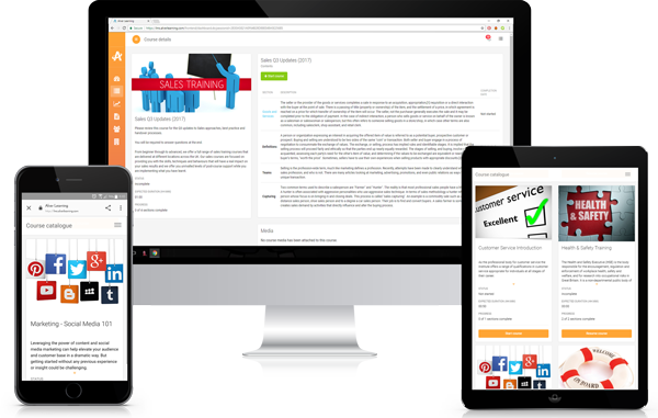
How to Make Your eLearning App Responsive?
Now, let’s proceed to the practical aspect of responsiveness. What features will make your app responsive and adaptive to all screens and devices? Here are the pro tips to consider at the design stage. Following these recommendations will reduce the cost and volume of costly amendments and web design mistakes.
#1 Focus on the End-User
User-focused companies succeed much more often in the market of e-learning as they choose user-friendly layouts right from the start. The key to success with various users is in the choice of universally cross-platform compatible solutions. If you stick to layouts that work equally well in all browsers (Mozilla, Google Chrome, Firefox), on all devices (desktop PCs, laptops, tablets, and smartphones), and different platforms (iOS, Android), user adoption will grow exponentially. Modern users want no limitations and endless convenience. Thus, please give it to them with fluid, adaptive layouts working hassle-free anywhere and anytime.
#2 Make It Quick
Nothing kills a student’s motivation to continue more than a slow loading speed. If you make your users wait, the churn rate will likely increase soon. People are impatient with today’s fast-moving, innovative digital space and don’t tolerate delays and slowness. Thus, slow apps and pages loading with the turtle’s speed have no chances for success (unless you offer unique content for pennies).

#3 Leave only Essentials
Each e-learning resource’s creator is tempted to load their app or platform with lots of data. But the reality shows that most of that content is redundant and distracting. In fact, learners need to focus on the essentials and stick to the core processes of learning. This strategy helps them achieve sizable educational outcomes impossible with a huge mess of fancy features and entertainment elements on the page.
To achieve the minimalist effect, you need to think carefully and prioritize the content categories you plan to include. Oust anything that might hinder learners’ comprehension or act as a distractor. Making long-reads with loads of information on a single page is also counterproductive as you will urge your students to scroll up and down, losing their focus on the learning material. So, the best approach to e-learning layout design is to squeeze everything you need your students to learn into 1-2 screens. Make the menu navigable and clear, thus allowing users to find the page of interest and ensure that only relevant content is located on that page.
#4 QA Testing Rules
The basic method for testing is a preview. It would be best to have a couple of people with various proficiency and web design expertise look at your pages and tell you whether they are okay with the images, fonts, layouts, and navigation. If something looks weird or works inconveniently, it’s better to make adjustments before launch. Otherwise, you can stain your reputation and face a high churn rate.
#5 Make It Intuitive
The basic principle of a successful UX is an intuitive UI. Making the interface intuitive and user-friendly ensures that students get what they want from your app or platform. Problems with navigation distract students and steal their vital study time and focus. So, the best way to go with the UI design is to reduce the number of clicks as much as possible. Implement easy-to-tap buttons and make the user flow transparent; these steps will definitely improve your UX.
#6 Opt for Interactivity
Mobile use of a web page has certain limitations in terms of interactivity. The user doesn’t have a mouse that will show what buttons are tappable and which ones are only visual design elements. So, your task is to give users quick onboarding and familiarize them with interactive elements at the start of app use. Also, choose a distinct size and format for interactive elements so that the users catch up with your functionality quickly.
#7 Keep Mobile-Friendliness in Mind
As we’ve already said many times, mobile-friendliness is king in modern web design. Mobile apps can’t do without specific responsive design features aimed to improve the legibility of text, imagery, and layout. So, invest proper time and effort into making your UI truly adaptive and mobile-friendly not to scare your users off.

Source: from WebThemez
Responsive Design Is a Key to Success
As you can see, the modern mobile app market is very competitive, with numerous offers in your niche wherever you go and whatever you choose to do. Building your loyal customer base may be challenging if you don’t understand the essentials of responsive web design. Thus, make sure you do exactly what the user wants and make your app accessible on all devices. Incorporating responsiveness into all UI and UX design processes is your secret to market success.