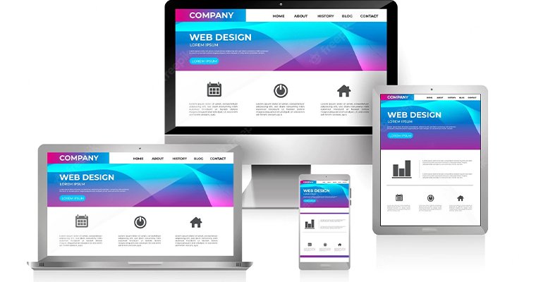
Think of a situation where someone is searching online for products or services offered by your brand. They click your website, then switch to a competing brand’s website within a few seconds. Does that sound relatable? The thing is, the visitor didn’t feel satisfied or convinced after checking out your homepage. That is why you must focus on making the corporate website homepage compelling and engaging.
Table of Contents
What you cannot skip
When it comes to homepage UI and layout, some things are non-negotiable. The navigation must be easy to use and aesthetically pleasing. Your visitors should not have to spend minutes figuring out the menu structure. They should be able to locate the desired service or product within a few seconds. So, keep the homepage UI and navigation simple.
On the corporate homepage, make it clear what your company offers. A first-time viewer should not have to struggle to figure that out. Using CTA in product pages is a must, but don’t skip them on the homepage either. The same logic applies to offering your contact information. It is basic but matters more than you think.
Watch out for web design trends
Web design trends keep changing over time. There is no single formula that works for all brands, though. However, you should use one or more of the latest trends chosen by the leading website design companies.
· It is good to offer a dark mode on your website. Dark backgrounds are easier on the eyes, especially for people who spend all day staring at screens. Additionally, a dark background helps bright colors pop. Be careful about choosing contrasting text shade.
· Some websites also feature huge font sizes. That becomes part of the design. This, however, may not work well for all brands.
· Keep animations and interactive elements on the homepage, but don’t overdo them. A live chat agent popping up or a hover button shifting a little looks fine. Ask the experts in the website design firm for proper assistance.
· You will find that a lot of brands are going for minimal design, and that holds for their homepages, too. They keep the pages clean with a lot of white space and let the content breathe. Too many elements create a cluttered look.
· You can also try some out-of-the-box designs and themes for your home page. For example, some companies are reintroducing early internet aesthetics—those late 90s, early 2000s look. They are also adding touches of modern design elements. It works when it feels intentional and connects to your brand story.
Things that you must avoid
There are some corporate homepage design mistakes that you must avoid.
· Do not make your page backgrounds look busy or cluttered. That makes the content hard to read.
· Do not make every element on the page play automatically. Whether it is music or animation, leave the choice to the viewers.
· Also, make sure the text isn’t too small and avoid using stock images.
Summing it up
You can be creative and think outside the box to redesign the corporate homepage. However, keep your focus on the basics and what your users need. For the proper guidance and output, look for veteran web design entities like BigDropInc.com.

