

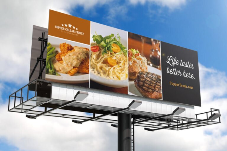
You’re driving. Music on, mind wandering, maybe thinking about dinner. A billboard passes on your right, and five seconds later, you’ve forgotten it existed. Or you haven’t, and somehow three weeks later you find yourself Googling the company. The difference between those two outcomes isn’t luck. It’s design.
Billboards work on a specific set of psychological principles, and the ones that succeed follow them closely. For anyone working with a billboard advertising agency or evaluating creative, understanding what actually happens in the brain during those few seconds changes how you judge a design.
Table of Contents
You Have Three to Seven Seconds To Make an Impact
Unlike digital ads or print, billboards have no extended viewing time. Research suggests people look at billboards for roughly three to seven seconds, and a driver at highway speed might get five.
If the message isn’t processed in that window, it doesn’t stick. Every design decision has to serve comprehension speed rather than aesthetic complexity.
Use Seven Words or Fewer
The word count rule exists because of cognitive load. Reading requires processing, and processing takes time you don’t have.
The consensus across the industry lands around seven words maximum, with some pushing to ten as an absolute ceiling. If your design has more than ten words, there’s almost certainly too much copy. Bold, legible fonts that require minimal effort to read reinforce the same goal.
Contrast Does the Heavy Lifting
The human brain processes high-contrast visuals more effectively, making color selection critical rather than just decorative.
Light text on dark backgrounds, or the reverse, consistently delivers the best readability from a distance. Black on yellow is among the highest-contrast pairings available. White on blue reads easily. Combinations with low contrast, no matter how on-brand, simply fail at 60 miles per hour.
Size Follows a Formula
Text sizing isn’t guesswork. The standard is a 1:10 ratio, meaning one inch of letter height for every ten feet of viewing distance.
At 300 feet, typical for highway viewing, letters should be at least 30 inches tall for the main message. At 500 feet, you’re looking at 50 inches. Bold sans-serif fonts can work slightly smaller. Thin or decorative typefaces need more.
One Image Beats Many Words
People remember pictures long before words, which is why a single strong visual often does more work than any headline.
The most effective billboards achieve genuine synergy between image and text rather than treating them as separate elements. There’s a subtler trick here. A model looking toward a product or logo can subtly direct attention exactly where the advertiser wants it, enhancing message retention and product recall. Gaze direction guides the viewer’s eye without them noticing.
Have One Message, Not Five
The most common mistake businesses make is trying to advertise everything on a single board. Phone number, website, social handles, three services, a tagline, and a logo.
Pick one. Including multiple contact methods clutters the design and reduces overall impact. Choose the single action easiest for your audience to take, and let everything else go.
Placement Affects Attention
Design isn’t the only psychological variable. Where a billboard is placed affects how much attention it receives.
Research using eye-tracking has found that advertisements located on the driver’s side of the road record more fixations than those on the opposite side. Counterintuitively, the same research found that drivers looked at advertisements at road level more than at those elevated three or more meters above the ground.
Height doesn’t automatically mean visibility.
The Medium Has a Real Advantage
Part of why billboards work has nothing to do with any individual design. Out-of-home advertising operates in an environment free from the clutter of feeds and banner blindness.
Research aggregating studies from 2017 to 2022 found that out-of-home ads produce significantly higher ad recall than television, podcasts, radio, print, and online executions. Physical presence creates stronger memories, partly because people remember the context of seeing something in the real world.
Make the Logo Findable
Your logo doesn’t need to be the largest element, but it should be easy to locate and recognize within seconds. Brand recognition is often the primary goal of a billboard, even when a call to action is included.
If someone can’t tell who the ad is for at a glance, the creative has failed, regardless of how clever it is.
Test With the Five-Second Rule
The simplest quality check available: show your design to someone for five seconds, then take it away and ask what they remember. If they can’t recall the brand and the message, the design needs work.
Great billboard design isn’t just what looks good in a portfolio. It’s about what functions psychologically in the narrow window you actually get.


